Deepcloud AI
USA
UX/UI design, Frontend, Motion Design
Landing Page
~300
May 2018
The collaboration started when one of our clients advised DeepCloud AI to approach us for their web development project.
DeepCloud AI had a negative previous experience with their former web developers, and during the project launch, they had rather negative sentiments.
After a few negotiations, we managed to reach a consensus, building mutual trust and agreed the client needed a logo development in addition to the website development. DeepCloud AI provided us with the scenario for the motion animation, which we had to bring into existence and implement on the website. It was an information impulse, which goes through the product, gets processed, then goes to the Internet of Things. As a result, we created a cool scroll-animation, which goes through the whole website content.
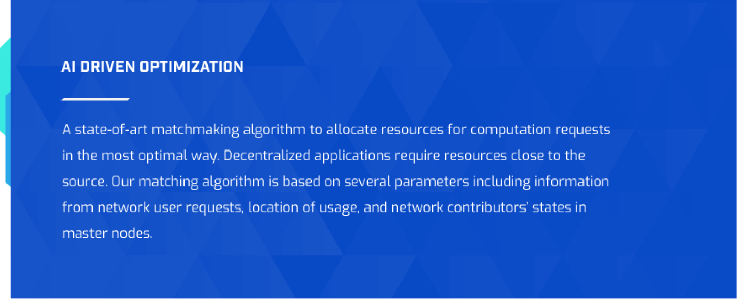
They provide a spot market for computing and storage resources for companies and individuals to share their excess capacity on DeepCloud’s decentralized cloud, and with their AI Matching engine, pair these resources for application developers.
Applications execute in a secure sandbox on the peer-peer resources, and all transactions are managed on the blockchain via smart contracts. They also have an application marketplace for developers with pre-validated applications to speed up the development of their end to end solutions.
Hence, we drew a modern triangle-based cloud, as if sparkling with the lightning of information.
Also we placed a lot of triangle-based elements on the website in the form of icons and buttons.
In this project, we efficiently utilized the stylish and futuristic digital style, lightweight texture, and the stretching of the blue color.
The motion animation was aimed at adding the ‘wow’ effect to the website. In spite of the fact that we created it according to the client’s scenario, we put together all our creativity to draw this net of micro schemes, where the informational flow moves freely.
Our principal designers implemented the impulse animation going vertically throughout the main page while scrolling down. The animation fits perfectly with the custom icons, transparent background, and clean fonts.
We made a concise roadmap with good usability, compactness, and exceptional clarity.
The roadmap for the Deepcloud AI is well-thought-out, structured, perfectly organized, and it powerfully resonates with the dominant theme of the website.
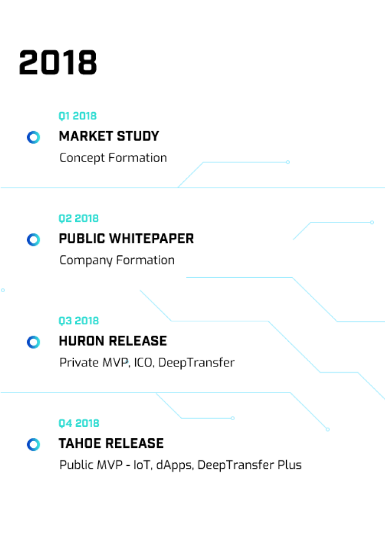
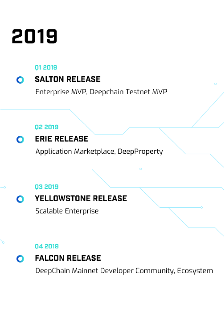
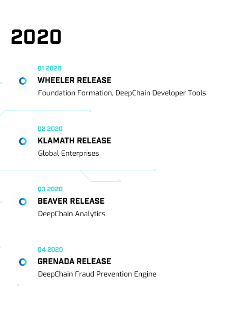
The portfolio section looks crystal clear and fresh. All the key elements are arranged in a structured way and are paired with the impulse-like graphical elements. At this place we employed a convenient animation - when you hover on any element, more information appears.
All for a more accurate perception of information. The client provided us with the content for the website, different in size. As a result, we put together our creativity to develop an unconventional solution for the information boxes.
We made this section quite chaotic, but still integral and cohesive, and highlighted the info with the different shades of blue.
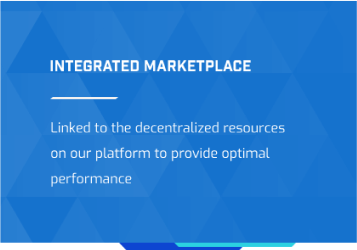
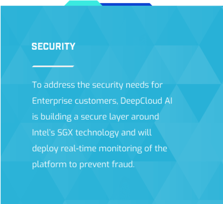
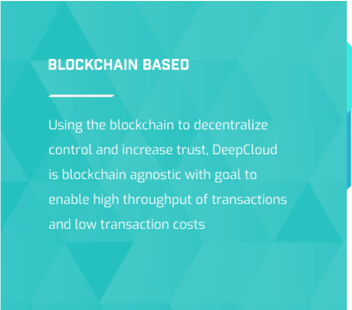
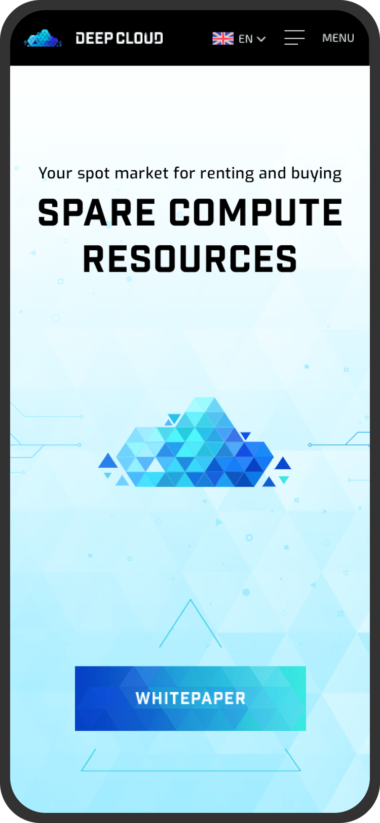
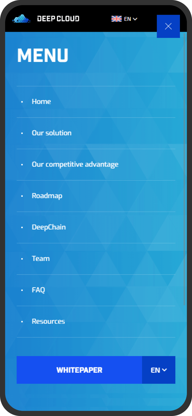
More and more visitors are using mobile devices such as tablets and smartphones to navigate websites. Our designers produced adaptive, predefined layouts that have been carefully constructed for a variety of common screen sizes and resolutions.
The site was developed using HTML5, CSS3, SVG, JavaScript (ES5) JQuery, GSAP for animations and Prismic as headless CMS.
 Discover

Choose the appropriate type of project in order to correctly develop the best functionality that will help make the site user friendly.
In the following steps, you can always review it.
Here you can choose as many options as you like.
The more information, the more productive the collaboration and result will be.
Add contact information who will be the contact person and responsible for the website.
We do not post your data in the public domain and do not use it for advertising or other purposes, except to provide you with the main service by us.