Ankr
USA
UX/UI design, Prototyping, Frontend Development
Landing Page
~300
May 2018
After we had successfully implemented a landing website project for Ankr, the company approached our team again for the development of a full-fledged multipage corporate website. Satisfied customers always return back!
Presently, the ultimate aim of the project was to strengthen the face of the Ankr brand, retain existing customers and attract new ones, and maximize the company’s revenues.
In order to highlight the technical value Ankr offers to its users and investors, we unanimously decided to focus on the high-tech minimalistic design and convenient website navigation. We gave a hundred and ten percent of our commitment to create the refined and austere finish for the Ankr website.
This project represents a logical continuation of our previous work for Ankr, where we were developing a landing for them. Presently we leveraged all our experience and creativity to inventiveness a fully-functional website with a multi-page menu.
Our team decided to reinvent their corporate branding identity, give a subject second thought to the branding colors, and rethink their identity concept.
To create an unobtrusive premium motion animation, we took an Ankr logo for the direct inspiration. Their logo sparks a thought of sharpened edges, meaningful geometry, customer-centricity, and numerous possibilities.
We created from scratch eye-catchy informational and navigational elements, that draw the users’ attention in the right direction and help them manipulate the website information.
The well-thought-out roadmap section enables a quick glance into Ankr main milestones and objectives. The roadmap is complemented with left-right navigation buttons, provides a very clear overview of the company information, and looks crystal-clear.
We customly designed all the icons for Ankr corporate website, which look as if deep-frost in ice, properly reflect the website information, and fit with the general elegant style of the project.
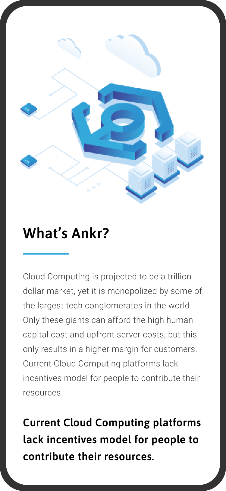
With the rise of mobiles, the Ankr website needs to adapt to literally every screen size. Consequently, we strived that the website properly detects the screen size and loads the appropriate layout for it.


The site was developed using Nuxt.js (Vue.js), GSAP for animations and Prismic as headless CMS.
Discover or Create Apps Using Blockchains and Cryptocurrencies
 Discover

Choose the appropriate type of project in order to correctly develop the best functionality that will help make the site user friendly.
In the following steps, you can always review it.
Here you can choose as many options as you like.
The more information, the more productive the collaboration and result will be.
Add contact information who will be the contact person and responsible for the website.
We do not post your data in the public domain and do not use it for advertising or other purposes, except to provide you with the main service by us.